Sunday, 26 April 2020

Audience Research: Audience behaviour

Source: https://www.journalism.co.uk/news-commentary/the-magazine-market-isn-t-dead-it-s-different/s6/a698229/

This section of the article highlights how technology has affected print magazines and how the content is the most important as it is no longer such of a high concern for customers to buy a specific magazine based on it's reputation of being elite. People can access everything online and therefore it is the actual content that will likely set you apart from the competition.
This article from The Guardian newspaper online argues a different standpoint, instead of the main  concerning threat being more consumers access the magazines online instead of physically buying them, it claims that actually it's social media that is one of magazine's biggest competitors as consumers are less interested in magazines and articles all together. I personally have to disagree, I think a lot of the magazines have simply transferred their content onto different platforms, such as Vogue and Beautyinsider who have stories and articles on Snapchat, even a lot of newspapers have moved their services to Snapchat also. I would also argue that social media platforms have increased their audience interactivity, many of the magazine articles have online poles for readers to participate in and also sometimes fun activities that require the reader to screenshot the story, draw something on it and share with their friends.
      The graph above shows a clear example of how much sales have decreased in print magazines over the last 15 years, I think it's no coincidence that it might have a correlation with rate of technological advancement.

Generic research: Textual Analysis 2

Please click on the image to make fullscreen


Wednesday, 15 April 2020

Audience Research: Feedback on Pitch

The first question I asked my classmates to answer was regarding my magazine's political stance. The majority responded neutral, regarding my two topics, successful business women and mental health I don't think it would be necessary to have a political tone but if it were needed I wouldn't be against suggesting the magazine was more left leaning.
The second question, I asked regarding one of the front covers which I thought would be around economy or something where there are successful business women and there can be a reference to an interview which would be inside the magazine (and perhaps on the website) discussing their leadership, dedication and passion which will be a positive representation of strong women (similar to the front covers of The Time, examples can be found in my mood board).The average result was 4.42 stars as can be seen above, which shows people agree with the topic being a good idea and I will take it further on.


The third question was about my second front cover which I suggested to be about mental health, and a famous person's experience about mental health to spread awareness. I got a 4.67 star response in agreement that it would be a good topic idea. I later got feedback to do an ordinary person's experience instead as it would make the reader feel like they have more in common with them which I think is also a really good idea (this will be brought up in question 7)
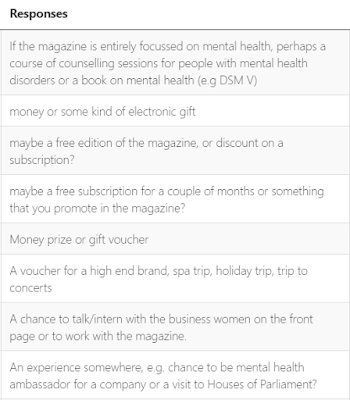
For the fourth question I asked for suggestions about potential prizes that could be used to reward customer loyalty, only those who purchased the actual magazine rather than read online would be able to enter. This could be in forms of hidden Easter eggs, such as on the front cover or on the spine of the magazine. I really like the the idea of a subscription to headspace (a meditation app) for the mental health front cover edition. Perhaps another prize for the other front cover, with the successful business woman, such as a chance to meet her or a chance to have a tour with the magazine. I think for the website I will also have more prizes, perhaps to promote the website there could be suggestions to the readers to check out the website to enter more competitions at the chance of winning even more.



For the fifth question, I asked for suggestions of shows surrounding mental health, this is to later on help me incorporate intertextuality into the mental health front cover edition. I will research and watch quite a few of these shows and reference them on the front cover.


For the sixth question, I asked for relevant movies to suit both of my front covers to fit my 16 - 25 demographic, similar suggestions but I will look into references from them I can incorporate into my front covers.


The first suggestion is one I think is very good, a "real" person would seem more approachable and relatable whilst a celebrity would create more awareness as people are more likely to pick up the magazine if it is a celebrity's face on the front cover. However, the second suggestion implies that they prefer real people over celebrities also, therefore I'm leaning more to not using a celebrity persona. I will also make sure to include current events as well as personal stories into my magazine to make sure it does fit the brief criteria of "current affairs magazine". The fourth suggestion is valid but I will most likely be using a male model for the mental health cover to make sure both covers can relate to a wider audience and also meet the brief's criteria (as the successful business woman cover will have a woman model).

Friday, 27 March 2020

Planning:Reflection on moderator's report


Top 10 tips from the moderator's report:

1. The best candidates included page numbers on the images anchoring them to the written contents, and appropriately laid out and sized text

2. Need to use a range of appropriate media language techniques (typography, images, fonts, backgrounds, logos , etc.) as appropriate to the purpose of the website; original audio or audio-visual content appropriate to the online website

3. There needs to be a clear sense of brand identity continuity throughout the magazine and website.

4. You need well-considered and appropriate photography being used and an overall design aesthetic being carried across both editions of the magazine, including the contents pages, and to the websites

5. To use Indesign and Photoshop as Photoshop isn't as good as Indesign when it comes to handling text and web design.

6. Students who did the most research and planning into the codes and conventions of the style of their magazines did the best.

7. Some of the most interesting work questioned issues of normative gender stereotypes.

8. The worst marks were given to those who did not fully complete the brief's objectives, e.g. 2 models from 2 different social groups

9. Lower marks were awarded to those who had generic mis-en-scene, e.g the back of the school field

10. You need a consistent high quality throughout, both the magazine front covers and the contents pages to be awarded top marks.

Planning:Pitch


Planning: Moodboard


I looked at Time magazine, The spectator, The Big Issue, Dazed and Gal-dem. I especially liked the format of Time magazine, the colour red is a really big part of their brand identity especially since red generally signifies importance. I particularly like the play on words "Lights. Camera. Power." of the front cover with Kate Winslet. Both her and Adele are dressed in red attire to really highlight their importance and to again promote brand association. The side portrait shot of them looking into the distance highlights their features whilst their half crossed arms with one hand raised signifies importance and femininity. Also the red contrasts the plain blue background which i think i will incorporate. They have not been portrayed overtly sexually which would best suit the message I want to come across in my magazine covers of independent and successful women who are not only on the magazine covers for the male gaze but for their minds and talent. Moreover, I really love the simplicity of the cover, not too crowded, the models are those in focus.
     I also looked at The Spectator, although the
 caricature style of the magazine isn't the look I want for my magazine, I can appreciate the satire of  topical issues, which agrees with the socially and politically conscious target audience that they would need to have to understand the jokes, which is the same as the target audience for my magazine. I also like the bold red mast headline, similar to Time which I think I will incorporate into my magazine.
   The Big Issue is also very much my inspiration for the mental health coverage, the colourful palette is the look I'm going for and I want the model to have bright colourful makeup or outfit. I also like the illustrations around the main image to really give the magazine a colourful fun look. They use a high level of intertextuality to engage with their readers which I also want to incorporate.
     Although Dazed and gal-dem aren't current affairs magazine, I love their women empowerment features and movement which I also want to include. The San serif bold font of all the magazines is a really good idea I want to add, and also I prefer capitalised. I will really experiment with the direct close up shots of the models for the front covers as it really highlights them and what they're meant to represent to the readers.

https://catalinapantiru.wixsite.com/voice

Final Statement of Intent

  How do you intend to use the four areas of the media theoretical framework to communicate meaning and meet the requirements of your chosen...