How do you intend to use the four areas of the media
theoretical framework to communicate meaning and meet the requirements of your
chosen brief?
Product 1 – Magazines and Contents pages.
For my magazine front covers, I
intend for them to fit the generic conventions of a current affairs magazine
aimed at a socially-conscious, 16-25, middle upmarket demographic through the
use of a sophisticated house style and language. From my research of other
current affairs magazines, such as TIME, I have discovered multiple key generic
conventions which will I aim to include. Such as minimalistic use of puffs, sell
and tag lines, alongside impactful masthead and headlines, and powerful images
of relevant cover stars. Across my two front covers and contents pages, I will
maintain a consistent colour palette and typography to achieve a strong sense
of brand identity, all the while using intellectual and engaging language to
appeal to the target demographic.
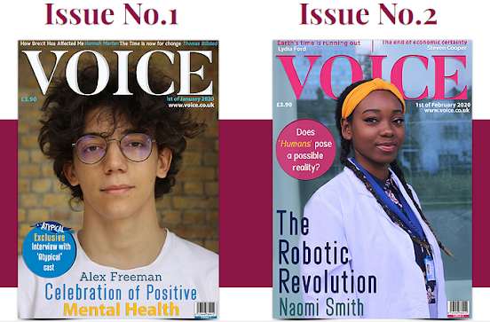
My first front cover will star
Alex Freeman, a best-selling young author who has written a captivating book
surrounding the topic of mental health. Freeman relates to the target
demographic because of his youthful age but also the topic of mental health is
particularly prominent with 16- 25-year-olds, whilst also being appealing due
to the mention of an ‘Exclusive Interview with the cast of Atypical’. From my
research, this particular use of intertextuality is interesting to the intended
readers as it is very popular amongst the target demographic. Moreover, the
show also relates to the topic of mental health for further subject continuity.
Adhering to Hall’s representation theory regarding stereotypes, Freeman is
wearing glasses and has unkempt hair to reflect his author persona which in turn
is an encoded message that audiences will quickly understand.
My second front cover will star
Naomi Smith, a robotic engineer that has helped create the robots being used in
hospitals to help with the battle against COVID. This issue will promote
feminism, which is a relevant topic for the target demographic. I will construct an appropriate representation of her as a robotic engineer through the use of a
lab coat, professional attire, and a lanyard. For accurate use of mise-en-scène, behind Naomi will be what resembles the exterior of a
lab building. I will also include intertextuality through the mention of an
interview with Naomi where she discusses the possibility of AI becoming
conscious, similarly to in the show Humans. From my research, this is a show
beloved by the target demographic also. Both front covers will fulfil the brief
through the inclusion of barcodes, edition, price, and date as well as
representing two different social groups. Additional article headlines will be displayed to further adhere to the generic
conventions at the top of each issue's cover.
Both
contents pages will present a cohesive and clear sense of brand identity
through the use of a sophisticated colour palette of burgundy and a deep yellow
and a consistently clear house style. They will fulfil the generic conventions through
the inclusion of a higher ratio of articles to images. It will also include page
numbers and reference to a podcast available on the website. I also intend to include
a call to action for readers to visit the magazine’s website which reflects
the evolution of the magazine industry has to adjust to the target
demographic’s consumer pattern. Also, I will ask them to tweet #kickingit and a
picture of them ‘kicking it’ as women in everyday life to promote feminism. Versus
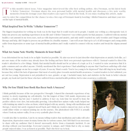
in the first issue, the contents page will announce they can enter a
competition to win a free copy of Freeman’s book ‘A Better Tomorrow’.
Product 2 – Website
The website will further reflect a clear sense of brand identity
through the use of a consistent and clear colour palette, typography, and
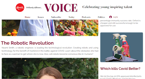
formal mode of address. I will include relevant additional articles on the home
page and use a layout easy to navigate and that is user-friendly, similar to
The Spectator’s website and TIME’s. I will also include a comment section where
users can voice their opinions, which encourages audience participation. I will
include sneak peeks of the latest issues and contents pages to intrigue readers
to subscribe.
From the research I
conducted about the current affair’s magazine industry and websites, such as
The Week, I discovered a common pattern of including the latest top news events
listed as the ‘Daily Briefing’ which I too will incorporate. I will also add
the Dennis publishing logo across both my contents pages and website to fulfil
the brief. On the second page, titled ‘Issues’, I will include a behind the
scenes exclusive video of Freeman’s photoshoot and an interview with Freeman
for his book and a hidden Easter egg: when you click on a picture of him it
will take you to another page where it announces the competition to enter to
win a free copy of his book. Moreover, I will include a working link to the
mental health website ‘Mind’.
In the navigation bar, I will include realistic topic tabs
such as Business and Politics to fulfil the generic conventions of a current
affair’s website. Alongside the slogan ‘A Platform For All Voices’ that creates
further brand identity, I will also display it on the contents pages.
How do you intend to link your
media products to demonstrate your knowledge and understanding of the digitally
convergent nature of your media production?
From my research regarding the publishing
industry, the decreasing rates of print subscriptions highlights the clear
change in user consumption patterns, significantly more so in the target
demographic. Studies have clearly shown that consumers are choosing to receive
their news and other entertainment online as opposed to print. This is why I
will ensure that VOICE magazine highly encourages digital convergence to improve print subscriptions and allow readers the ability to
be more active, Shirky’s audience ‘End of Audience’ theory. I will include a
pop up when readers enter the website that encourages them to subscribe and
offers students 10% off, which is very applicable to the target demographic.
I will do so through the inclusion
of a multitude of social media icons on both contents pages and website that
suggests the readers follow the magazine via the online platforms. A few
examples are Snapchat, Instagram, and YouTube, which are the most popular
platforms the target demographic frequently visit. I will also include a call
to action encouraging readers to visit the online website for more exclusive
content, such as in the first issue, the opportunity to win a free copy of
Freeman’s book but also to subscribe and have access to the VOICE podcast.
In the second issue I will
include an additional call to action that instructs readers to tweet #kickingit
and how they are kicking it as a woman in everyday life, and to tag VOICE
magazine for the chance to make a feature on the website, which will encourage
audience participation, Jenkin’s participatory theory. On both the website and
contents pages, I will include offers for a subscription that allows students 10%
off. This will also be advertised on the website with an additional offer to
promote digital subscriptions and interaction.
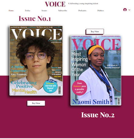
In both contents pages, I will include
images of both issues which will encourage and entice readers to subscribe in
order to have access to more. I will also include an Easter egg where readers
have the chance to win a free copy of Freeman’s book which further encourages
audience participation and I will include working links to the mental health
website ‘Mind’ as from my research, articles surrounding mental health include
helpline details at the end.


