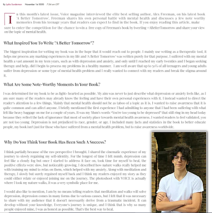
I started my 2nd page which includes a behind the scenes video of the photoshoot with the first cover
star. I really liked how it turned out, a potential improvement would be to make it landscape but then I
couldn't include the pictures as proportions wouldn't fit. I also included a sneak peak inside the contents page to encourage viewers to subscribe to the actual magazine.
For the interview I used a very formal layout and split it into paragraphs, after some research with
different current affairs website interviews, this seemed the most appropriate layout. I also included
a picture of Alex and a helpline contact number as the article is to do with mental health and it added
authenticity.
On the main home page I decided to change the original daily briefing I had as the layout was difficult to read. This has a timer and is far more clear. Also, I included the daily briefing to correspond with Dennis Publishing's magazine, The Week's brand identity and fulfil the brief and generic conventions of a current affairs' website homepage.


No comments:
Post a Comment