Friday, 29 January 2021

Progress: Website


I've added an editors note at the beginning to introduce readers to the website so they 
understand what type of magazine it is and also I've added a 'Most Popular' articles
that fits the generic conventions of a Current affairs website
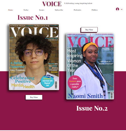
Here I've added the front covers and labelled them clearly as issues

This is a response to the call to action on the contents pages where readers would have 
shared images of them being empowered women 
Here I included a Daily Briefing of the latest news as due to research, the
magazines that are published by Dennis, e.g. the Week, also includes this
so I'm fulfilling brand identity

Here I'm encouraging user interaction by commenting their opinions and 
the slogan "where your voice will be heard" shows the magazine encourages
interaction. I've also included the Dennis publishing logo for more brand identity
and social media links for cross media convergence.
Throughout the website, the colours fit in with the brand identity of the contents pages.


Wednesday, 20 January 2021

Progress: Contents Page


 Here I have improved Niomi's contents page by making her face larger but for it to take up less room on the page so I have more space for more text (It looks bare but this is just a draft, the previous one shows the where the magazine front covers will go and the call to action etc) and then on page 3 I've included what's on the front cover and some features of articles appropriate to a Current Affairs magazine contents. 

Wednesday, 13 January 2021

Update: second contents page


 I spent the lesson rearraging the page, font and colours and also added some other graphics on the bottom left to show the people who will be featured on what articles

Tuesday, 12 January 2021

Updates on second front cover

Based off of feedback from my target demographic, I made the cover star's face and body larger to fill up the magazine more and be more of the focal point and I experimented with layout and more simplistic text (I still need to add some more writing, this is just a draft) and based on the picture's colour palette I experimented with different colour palettes such as blue to better match the first front cover but overall neither turned out as well as I would've liked so I'm going to keep trying until it looks right.


Monday, 11 January 2021

Update : front cover improvements based on feedback


These were some draft layouts I tested out before I singled it down between the two below 

From further feedback from my target audience, the  puff's text was too small and too detailed, therefore I shortened it and make it seem more accurate. I had to move the Atypical logo off the O in VOICE and onto the puff, because they said it made it seem like the name of the magazine was Atypical Voice. 
I gave my target audience these 2 options to pick from and they chose the one on the right but to make 'Celebrating Positive Mental Health' bigger 

Therefore, based on all the feedback I received, this is what I've constructed. I made the heading larger, and I made the puff, "A Better Tomorrow" and the highlighted text from the quote lighter colours so they are easier to read and changed the £3.90 and date and journalists' names at the top lighter too so the colour palette is more cohesive.


Friday, 8 January 2021

Update: Feedback on front covers and changes


Based on feedback from my target audience, the Heading was too distracting and too far onto the cover star's face, therefore I've moved it to the bottom left and changed font and colour scheme slightly to be more visible on a white background.

Monday, 4 January 2021

Update: Front Covers

After doing some extended research into the show Humans (which links in with one of my front covers in which the main cover star is a robotic engineer) I decided this would be an excellent intertextual reference to include as my target demographic of 16-25 socially-conscious, middle to upmarket demographic would most likely understand the reference as they'd be interested in the sci-fi genre and also that it's available on Netflix and Channel 4, two streaming services popular with the demographic.

This is my final draft, I've fulfilled the brief by including a bar code, pricing (which I had previously worked out with the contribution of my focus group), date and website link (digital convergence)

I have also included attention grabbing headlines, selling lines and main coverline which relate well to topics current affairs magazines would include (based off of my previous research). 

I maintain consistent typography throughout both front covers to connote a sense of brand identity

I referenced page numbers for articles available in the magazine. 

I included accurate mis-en-scene of a glass looking science building (professional) and accurate representation of a robotic engineer with the lab coat and lanyard.

The colour palette compliments the other front cover in regards with white and yellow whilst the pink correlates with the website.

This is the 2nd front cover, it stars an author who wrote a best selling book on his mental health journey and therapy. I included an intertextual reference to Atypical, a show which focuses on abolishing negative taboo stereotypes on mental health. The show is greatly loved by the magazine's 16-25 target demographic

I stated inside the magazine there would be an 'Exclusive' interview with the cast of Atypical because that would intrigue the target demographic to buy the magazine due to celebrities.

I included a statistics quote about mental health which would appeal to a "well educated" target demographic and it was said by Demi Lovato, a celebrity well known and liked by the 16-25 target demographic.

The headline "Celebrating Positive Mental Health" uses positive language and is surrounding a topic very relevant to 16-25 year olds.


Consistent masthead between both front covers connotes a sense of brand identity, in regards to typography. 

I placed the Atypical logo on the O of Voice which would easily spotted and fans of the show would be interested in buying the magazine.  

The cover star displays direct mode of address and I used the rule of L, by placing the headline to the left, where the reader's attention would go to first. 

His representation is accurate for that of an author, his glasses connote a studious persona, his wild hair is stereotypical for an author also (although obviously not always true) 

Mis-en-scene of a brick wall doesn't tie in by itself, but with the mixture of the contents page (which offers a wider range of mis-en-scen)it explains the significance of where that brick wall takes place, it is justified. The brick wall allows for Alex to be the main center of focus, which is what cover stars on current affairs magazines usually receive
Update: draft front covers


Here I experimented with the masthead, on the left it's above her head and on the right it's behind her head, and added a few translucent boxes to signify where text will go. Overall I prefer the one of the right as it looks cleaner


This is for the other front cover, again I experimented with the masthead and layout, I will most likely change the layout of text as I create the headline and cover lines and will add more colour depending on what works best, however blue and pink work well with the magazine front covers so far.
Overall, I prefer the look of the one on the right

I conferred with my focus group and they all agreed the look with the masthead behind the cover star's head looks better.


Update: contents pages


I started experimenting with photo shop between these two images, the black border wouldn't be there, I had to screenshot it like that so the white was visible. I much prefer the picture on the left as it takes up less room since her arm is close to the pink box. However I actually decided to slant the box in the end and change the colour to a darker burgundy so it looked more sophisticated and more like a current affairs magazine

Here I've included more geometric shapes on page 3 so they correlate, and I've included the yellow colour palette to tie in with Niomi's headband and on the front cover. There are page numbers to indicate the front cover topics and I will add more of what's to come on page 3, along side more pictures of Niomi.

There I've added a Subscribe button to encourage readers to head online to the magazine's website and subscribe for monthly subscription and it also encourages digital convergence to follow them on platforms such as Instagram, Twitter and You tube, platforms very popular with their 16-25 target demographic


This is a brief layout of Alex's front cover so far, I've continued the same colour palette scheme from Niomi's for brand identity continuity. I've included the same digital convergence icons to encourage readers to explore the magazine further online.

https://catalinapantiru.wixsite.com/voice

Final Statement of Intent

  How do you intend to use the four areas of the media theoretical framework to communicate meaning and meet the requirements of your chosen...